I’m Joshua Sortino, a Miami + NYC-based Design Director, advisor, and investor. I will improve your startup’s user experience, design culture, and team. We should talk →


Put the phone on the table
and talk across languages
Creator · talkacross.app · 2026 · On TestFlight
Set it down and talk
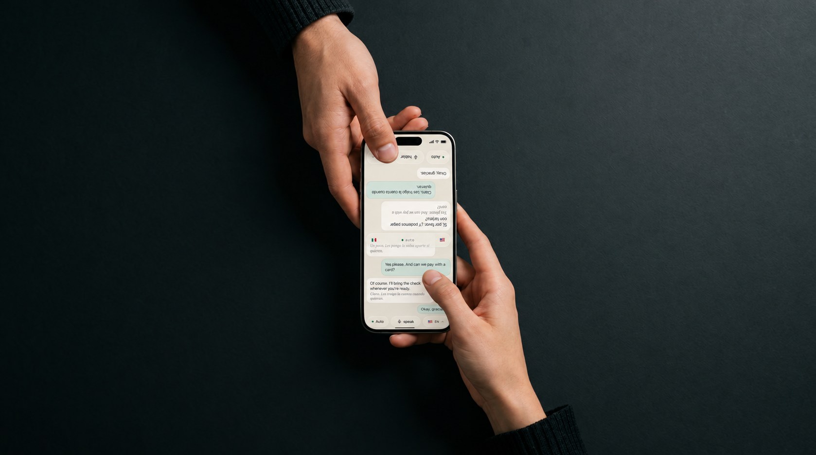
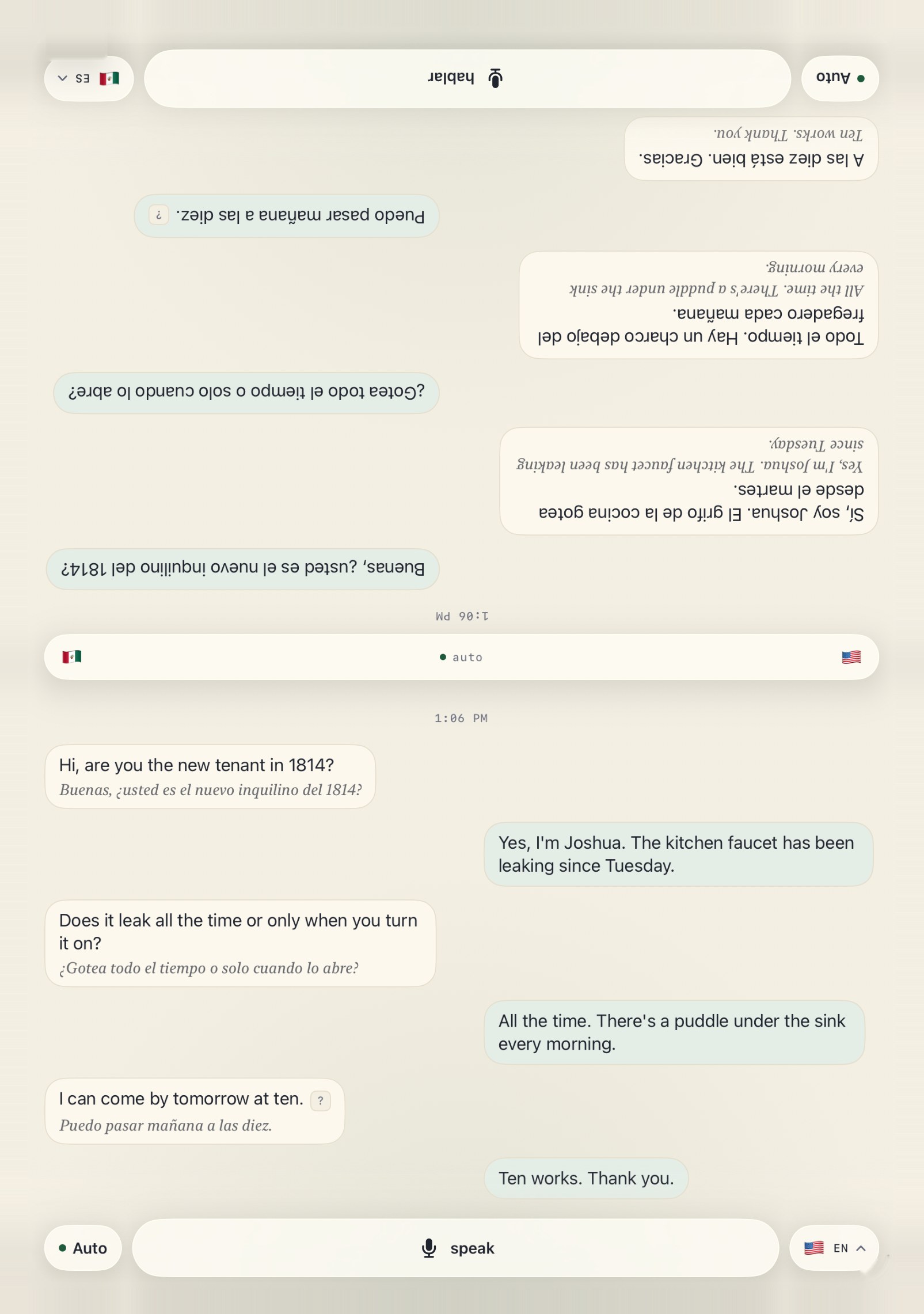
Most translator apps have you pass the phone back and forth and wait your turn. Talk Across lies flat on the table and splits the screen in two. The far half flips to face the other person, in their language, down to the buttons. Then you just talk.
Designed and built solo, from the brand to the Swift. In TestFlight now.
Their half faces them
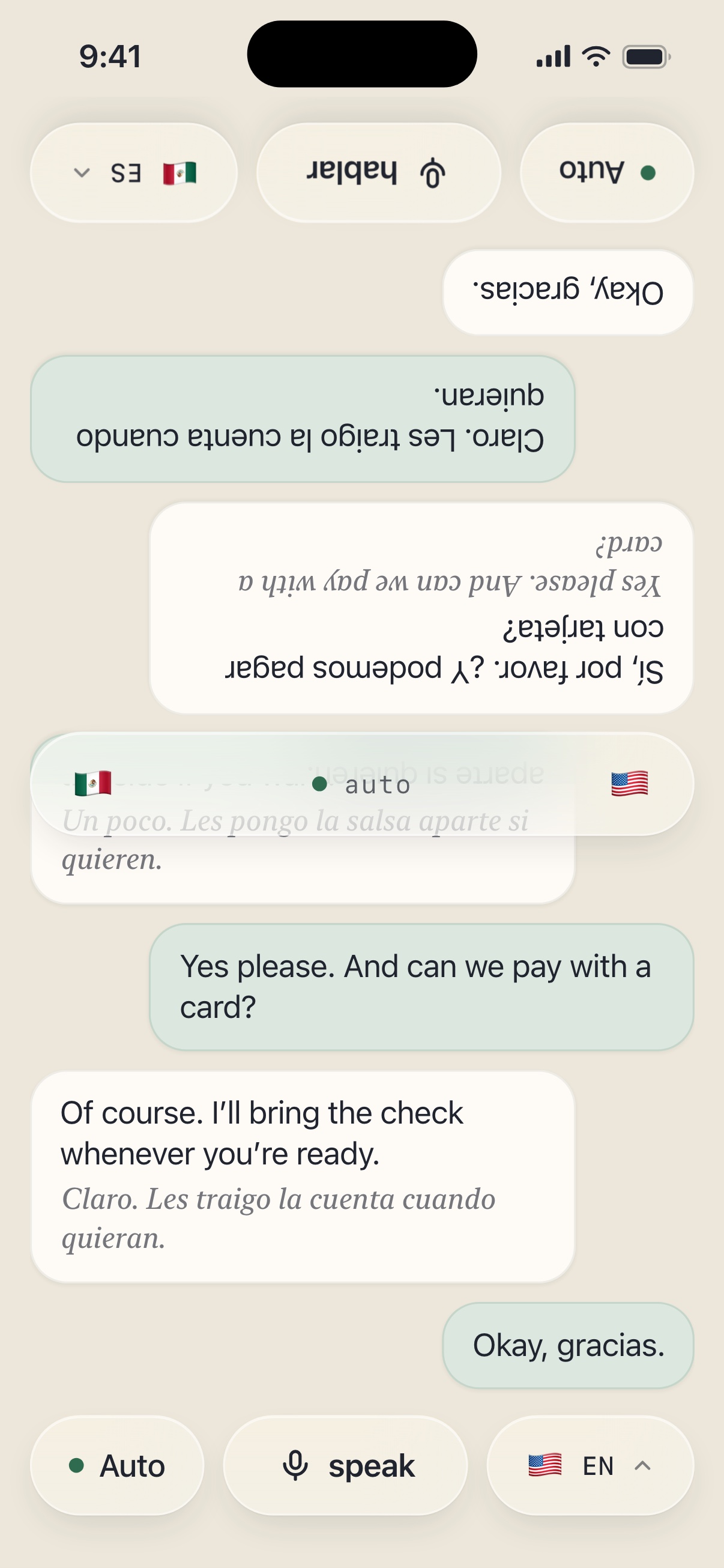
The far half is flipped and set in their language, buttons included – Preventing users from reading upside down.
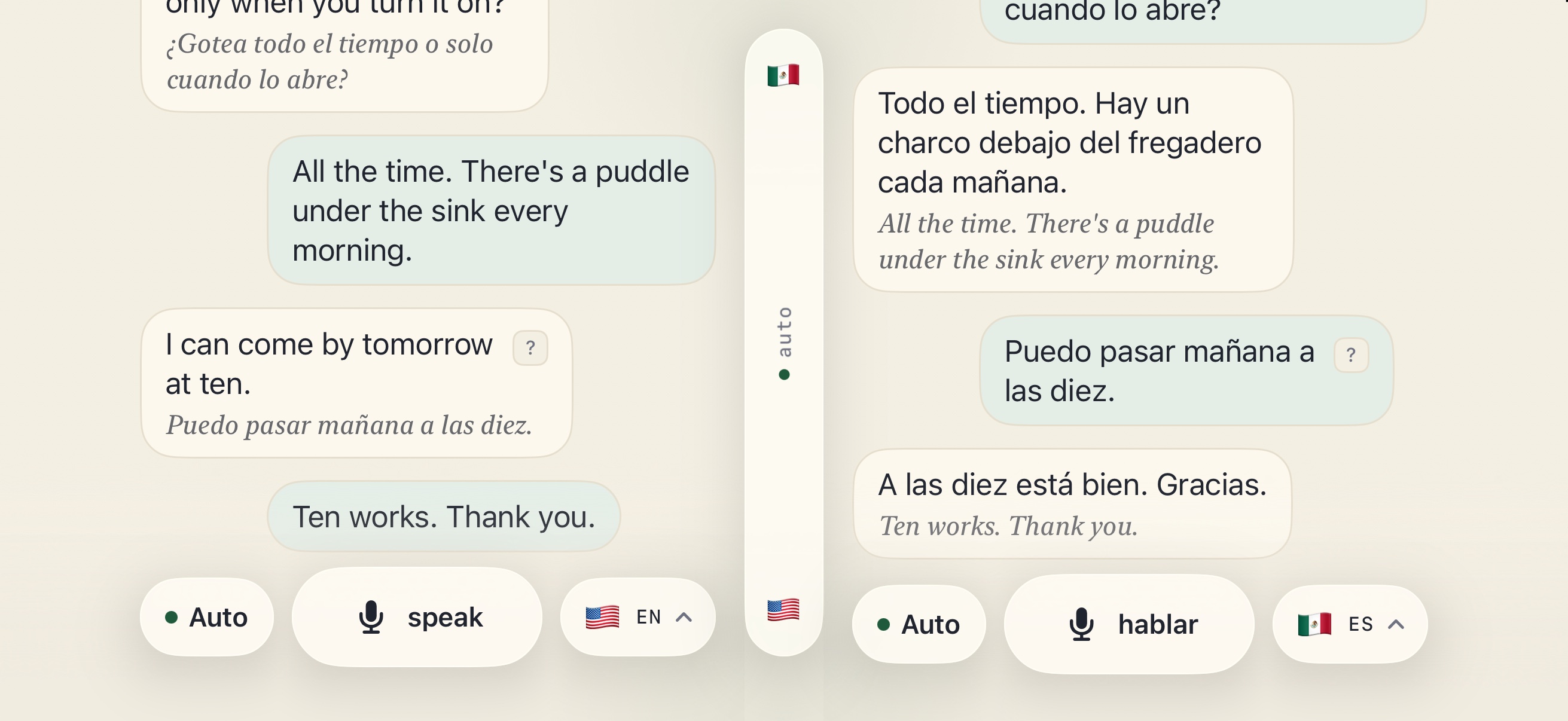
Shared controls in the middle
Both flags and the listening mode. Auto is on by default, so there is nothing to press.
Read the convo in your language
Every translated line keeps the original underneath, in italic. Seeing both is what makes people trust it.
Talk Across automatically parses who’s speaking
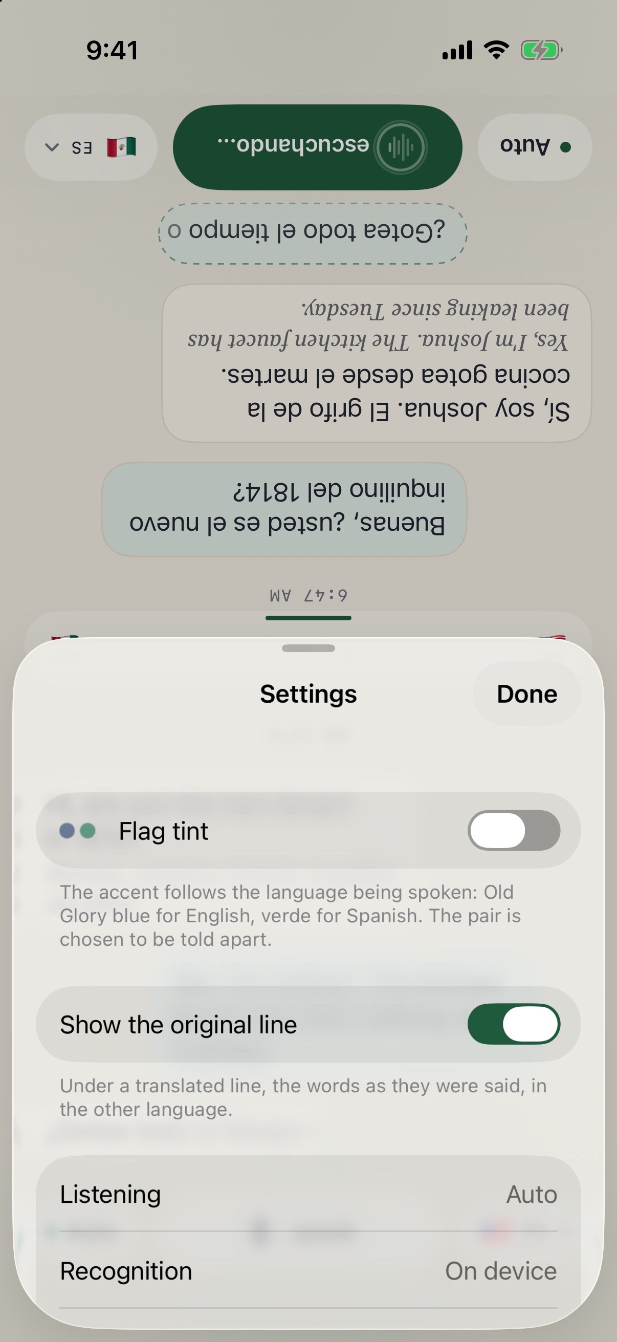
It’s all automatic. Every sentence gets filtered through three criteria: the language it was said in, a quick voice print, and an optional tap. Combined, the app files the sentence to the correct side, even a mixed line like okay, gracias. When the app guesses incorrectly, one swipe from the user moves the line across.
Sentences can grow, split, or merge a few seconds after they appear, as the transcript settles. I built and tested that engine before drawing a single screen.
Everything happens on the phone
Listening, transcribing both languages at once, working out who’s speaking, and translating all run on the device, in real time. None of it needs a server. No account, no recordings, nothing uploaded.
One phone, split two ways
Flat on the table, the screen splits top and bottom and the far half flips to face the other person. Turn it sideways and both halves stand upright, side by side. The strip in the middle displays both language flags and the listening mode.
Made for the iPhone Duo
Talk Across was designed for Apple’s iPhone Duo specs before holding one. Opened flat, the hinge becomes the strip in the middle. Folded into a tent, each person gets their own side of the screen.
- BookFlat on the table, one person per side.
- TentStanding up, half of the screen divided for each person.
- ProppedInner screen for you, outer for them.
Where it’s going
It started as a coach that feeds you your next line to say out loud, with pronunciation hints that fade as you get better. The table is the first piece to ship. The coach comes back on the Duo, one screen for the learner and one for the person across from them.
- p¿Me trae la cuenta?meh TRAH-eh lah KWEN-tahThe line, and how to say it
- mf¿Me trae la cuenta?meh TRAH-eh lah KWEN-tahThe hint fades as you get it
- f¿Me trae la cuenta?meh TRAH-eh lah KWEN-tahThen it’s just you
Takeaways
There are thousands of translator apps, but sometimes all it takes is a few adjustments to the user interface and feature offering to make a meaningful leap in user experience. The hard part was never the translation. It was knowing who said what, and being wrong gracefully, and presenting it to users in a less-clunky way.